Decorating With Bold Colors Made Easy
Safe beige rooms are comfortable, but they rarely make anyone smile when they walk in. Bold color does the opposite. It lifts your mood, shows your personality and makes even a small, ordinary room feel designed.
The good news is that decorating with bold colors is a skill, not a talent, and it follows rules anyone can learn. Most colorful rooms that work use one strong color repeated with intention, balanced by calm neutrals and plenty of texture.
These ten ideas move from the easiest accents to full room saturation, so you can start where your confidence is and go further when you are ready.
1. The Dynamic Entry: Bold and Bright Hallway Ideas

The entry is the safest place in the house to go bold, because you pass through it rather than living in it, so a strong color never gets tiring. Paint the inside of the front door in a saturated shade like deep teal, mustard or coral, or take the color across the whole hallway and keep the doors and trim white for contrast. A patterned runner adds a second hit of color at floor level and protects the busiest floor in the home. Because hallways are small, the paint cost is low and the change takes a weekend, which makes this the perfect first bold experiment.
2. The Color-Blocked Living Room Hub

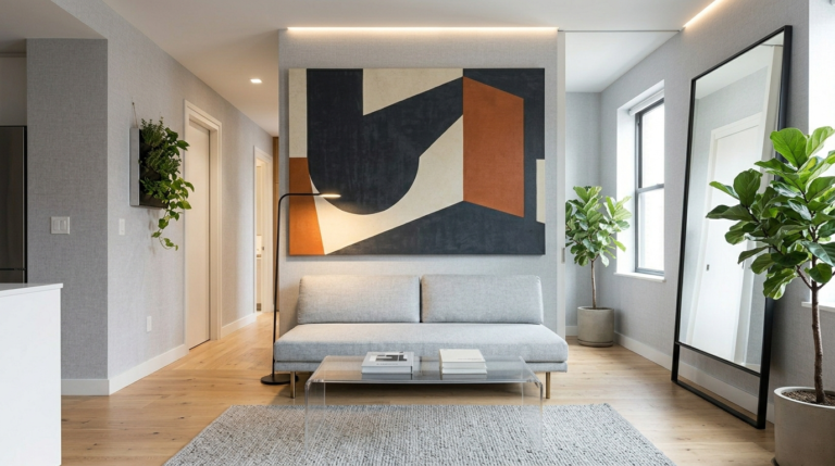
Color blocking means painting one clear zone of a room in a strong color and leaving the rest calm, and it gives a living room instant architecture. The classic move is the wall behind the sofa, painted from skirting to ceiling in a deep green, navy or terracotta. You can also block a reading corner, an alcove or the lower half of every wall with a clean taped line. Keep furniture in front of the block simple and light so the color stays the star. Then repeat the shade twice more in small pieces, a cushion and a throw for example, so the block feels connected to the room instead of pasted on.
3. Kitchen Contrast: Bold Hues Meet High Function

Kitchens love contrast because they are full of hard, practical surfaces that can take a strong color. Painting lower cabinets in a deep hue while keeping uppers and walls light is the most copied version, since the color sits below eye level and never overwhelms. If painting cabinets feels permanent, work smaller. A bold kettle, colored bar stools, a saturated Roman blind or a row of bright canisters all deliver the effect and can leave with you. Keep counters mostly clear and choose one color only. Two competing brights in a working kitchen quickly start to feel like clutter, even when the room is tidy.
4. Saturated Sanctuary: The Moody Master Bedroom

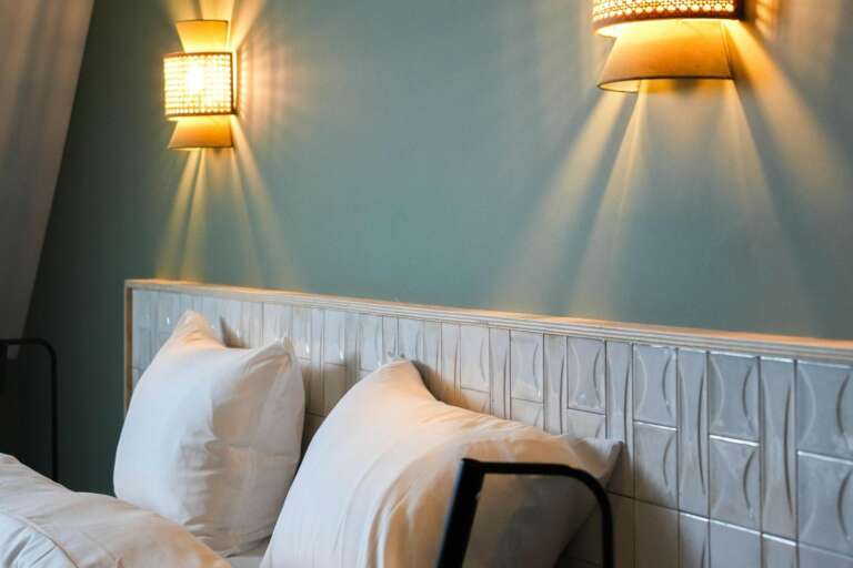
Deep, saturated color turns a bedroom into a cocoon, which is why moody bedrooms are saved so often. Forest green, inky blue, aubergine and charcoal all work, and they are surprisingly restful because low saturation light in the evening makes them read as soft rather than loud. The balance comes from bedding. Layer warm whites, natural linen and one lighter accent so the bed glows against the dark walls instead of disappearing into them. Warm metal or light wood on the nightstands keeps the mood rich rather than gloomy. Test the color on the wall behind the bed first and sleep on the decision for a week.
5. Advanced Color Drenching: The Saturated Bathroom

Color drenching takes one shade across walls, trim, ceiling and even the vanity, so the room feels wrapped in color. Bathrooms are the ideal place to try it, because they are small, often short on natural light anyway, and a bold result feels like a boutique hotel rather than a mistake. Choose a mid to deep tone with some warmth, and use a paint finish made for steamy rooms so the color survives daily showers. Break the saturation only with towels, a plant and metal fixtures. In a small bathroom, drenching actually makes the space feel bigger, because there are no contrast lines chopping it into pieces.
6. Curated Color: The Living Gallery Wall

A gallery wall lets you bring in several bold colors at once while keeping the walls themselves neutral. The discipline is in the frames and the palette. Pick three colors as your thread, and choose prints, photos and postcards that repeat them. Uniform frames in black, white or one wood finish make mixed art look like a collection instead of a jumble. Lay the whole arrangement on the floor, photograph it, and adjust before anything touches the wall. Start the lowest frame about a hand’s width above the sofa back. This is also the easiest idea in the list to update, since swapping one print changes the whole wall’s mood.
7. Strategic Lighting: Saturated Accents

Lighting changes how bold color behaves. The same red cushion looks rich under warm light and harsh under cold white bulbs, so your lamps are part of the color scheme. Use colored shades and bases as small, confident accents. A saturated ceramic lamp on a side table or a pair of jewel toned pendants over a dining table adds color exactly where the eye lands in the evening. Choose warm bulbs throughout bold rooms, since cool light drains saturation and turns deep colors gray. If a color you loved in the shop looks wrong at home, change the bulb temperature before you blame the paint.
8. Textural Pop: The Bright Velvet Accent

Velvet makes bold color look expensive. The pile catches light at different angles, so a single velvet chair or a pair of cushions in emerald, sapphire or ochre reads as rich and soft rather than flat and loud. This is the lowest risk way to live with a strong color, because one piece can move rooms, be recovered, or be sold on. Place the velvet where light falls across it, near a window or a lamp, and keep its neighbors matte and calm so the contrast in texture does the decorating. A velvet throw over a plain sofa arm gives a smaller dose of the same effect.
9. Graphic Grounding: The Bold Patterned Rug

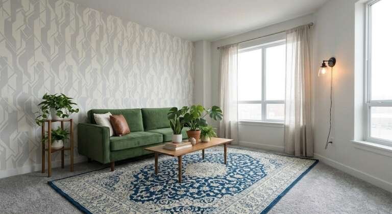
A bold rug grounds a colorful room and gives you a ready made palette to copy. Every color in the rug is a color you can safely repeat in cushions, art and accessories, which removes the guesswork from the rest of the scheme. Go large. A patterned rug that is too small reads as a bath mat, while a generous one that slides under the front legs of the seating ties the whole group together. If your furniture is plain, choose a strong graphic pattern. If your furniture already carries color, choose a rug with a quieter pattern in the same family, so the room has one pattern hero, not three.
10. Dining in Color: Vibrant Tablescapes

The dining table is bold color with no commitment at all. Colored glassware, saturated napkins, a strong runner and a bowl of bright fruit can transform a plain table for one dinner and go back in the cupboard the next day. Build the scheme in layers. A base cloth or runner in your boldest shade, plates in a calm neutral, then color again in glasses, napkins and flowers or fruit. Candles in one of the table colors pull the scheme together when the light drops. Because nothing is permanent, the table is the perfect training ground before you paint a wall in the same palette.
Conclusion
Bold color stops being scary the moment you treat it as a system instead of a leap. One strong color, repeated on purpose, balanced with calm neutrals and helped by warm light and texture, will work in any room in the house. Start with the reversible wins, the entry door, a tablescape, a velvet cushion, and let your confidence grow with each one. When you are ready, the bigger moves like color blocking and drenching use exactly the same rules on a larger canvas. Your home should make you feel something when you walk in, and color is the fastest way to get there.
For the next step, see these color drenching ideas for small rooms.
And if you want to go further, start with these maximalist small space decor.
Frequently Asked Questions
How many bold colors can I use in one room?
One main bold color plus one supporting accent is the safe formula for most rooms. Repeat each color at least twice so the scheme looks planned. If you love many colors, use a patterned rug or gallery wall as the piece that ties them together, and keep walls and large furniture calm.
What if I choose a bold color and hate it?
Start with the low commitment versions first, such as cushions, throws, art and table linens, and live with the color for a few weeks. For paint, test a large sample on the wall and check it in morning and evening light. One wall or the inside of a door is a cheap place to learn what you truly like.
Do bold colors make a small room look smaller?
Not when they are used with intent. A saturated color on all walls, the color drenching method, can make a small room feel larger because there are no contrast lines breaking it up. What shrinks a room is one dark wall facing bright white ones, combined with clutter. Keep surfaces clear and the color will feel like a cocoon.
Which bold colors are easiest to live with?
Deep, slightly muted shades are the most forgiving. Forest green, navy, terracotta, mustard and aubergine all pair well with wood, white and warm metals, and they look good in both daylight and lamplight. Very bright neon tones are harder, and work best in small accessories rather than on walls.