How to Build a Gallery Wall Above the Couch: 9 Layouts That Work
Nearly every gallery wall that looks wrong breaks the same two numbers.
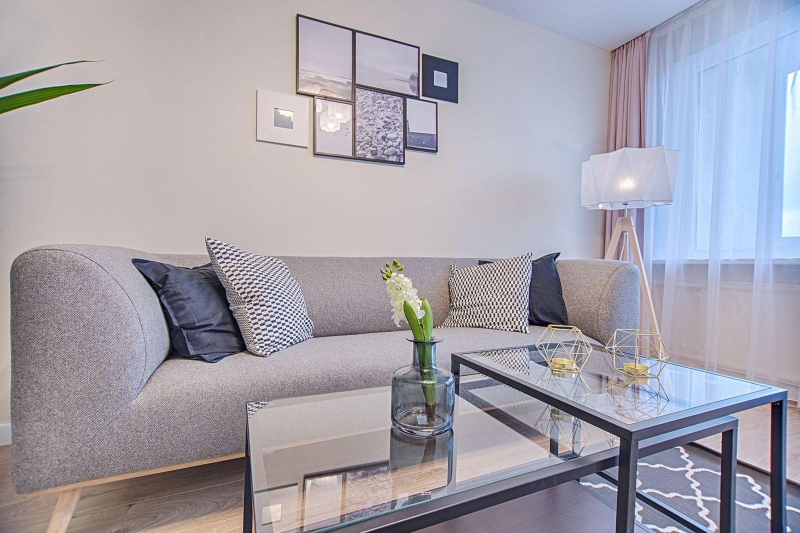
The grouping spans too much of the sofa or too little, and the gaps between frames wander. Get those two things right and almost any art you own starts to look collected. Get them wrong and even good art looks scattered. The figures are simple: the whole group should span about 60 to 75 percent of the sofa’s width, never wider than the sofa itself, and frames sit about 2 to 3 inches apart, the same gap everywhere. Those are widely used decorator guidelines, not hard laws, but they are the difference I see every single time. Proportions first. Then pick one of the 9 gallery wall ideas above the couch below to match your sofa, your ceiling and your nerve.
The short version, before we start:
Span 60 to 75 percent of the sofa. Never wider than the sofa. A group that overhangs the arms looks top heavy no matter how good the art is.
One gap, repeated. Two to three inches between every frame, everywhere. Inconsistent spacing is what makes a wall look accidental.
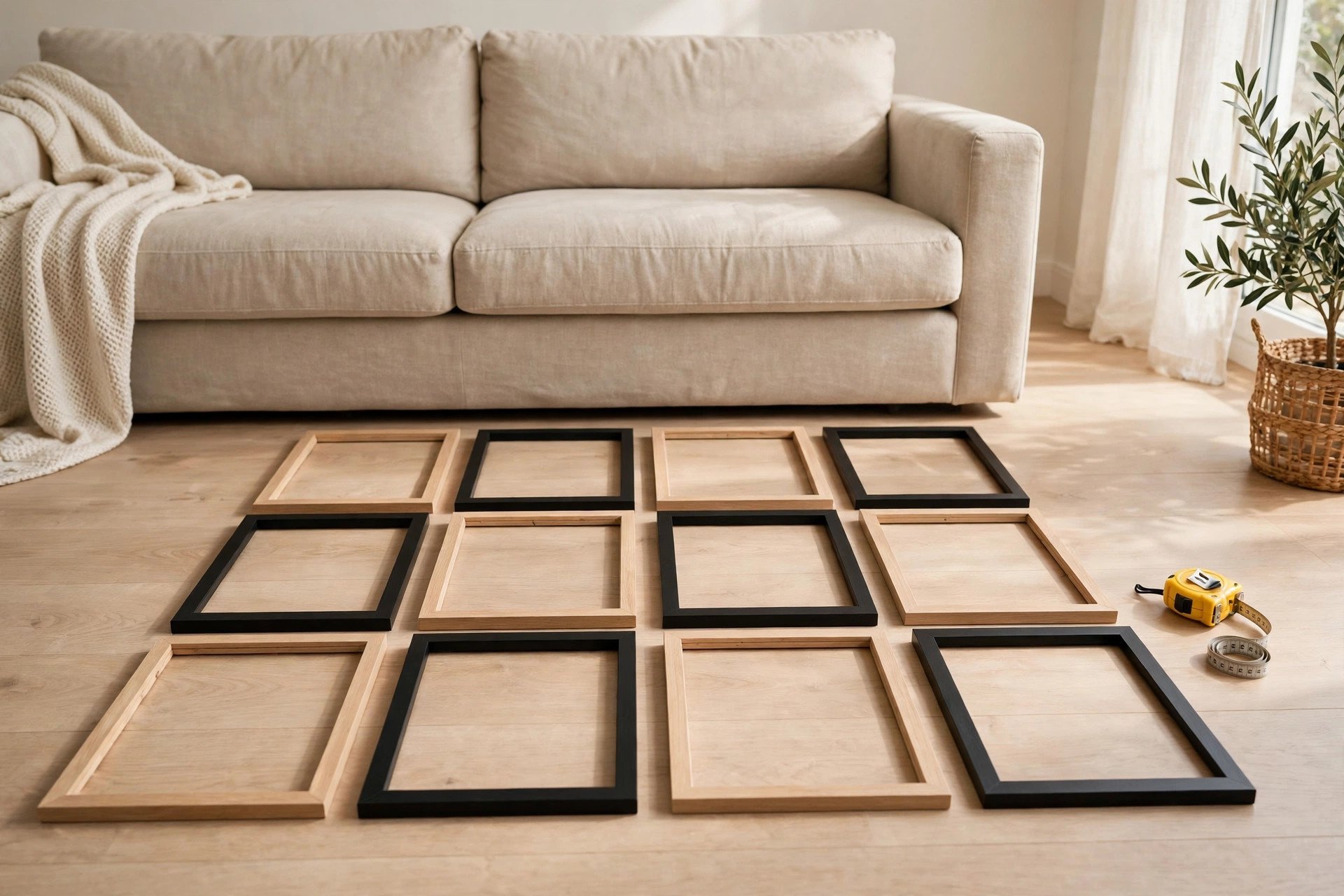
Plan on the floor, prove it in paper. Lay the arrangement out on the floor, photograph it, tape up paper templates, live with them a day. Then holes.
Bottom edge at a hand span. The lowest frames sit about 6 to 8 inches above the sofa back, with the center of the group near standing eye level.
Before You Hang Anything: The Four Steps
Every layout below follows the same four steps, and skipping them is how test holes happen.
Step one: measure the sofa and mark 60 to 75 percent of its width on the wall with painter’s tape. In rooms planned around small living room furniture layouts, check that taped outline also clears side tables and lamps. Step two: lay the whole arrangement on the floor inside the same dimensions and photograph it. Step three: trace each frame onto paper, tape the templates up, and live with them for a day. Step four: hang the center piece first, level it, and work outward.
Templates feel slow. They are still faster than patching plaster. While they are up, sit on the sofa and stand in the doorway and look from both. The bottom of the group should sit a comfortable hand span above the sofa back, low enough that seated eyes meet art rather than wall. I leave templates up overnight, every time. Morning light has saved me from at least three crooked walls.
[IMAGE BRIEF: Paper templates taped to a wall above a sofa showing the planned gallery wall layout, landscape orientation | File: gallery-wall-above-couch-paper-templates.jpg | Alt: Paper templates taped above a sofa marking each frame position]
1. The Classic Grid, for People Who Trust a Tape Measure
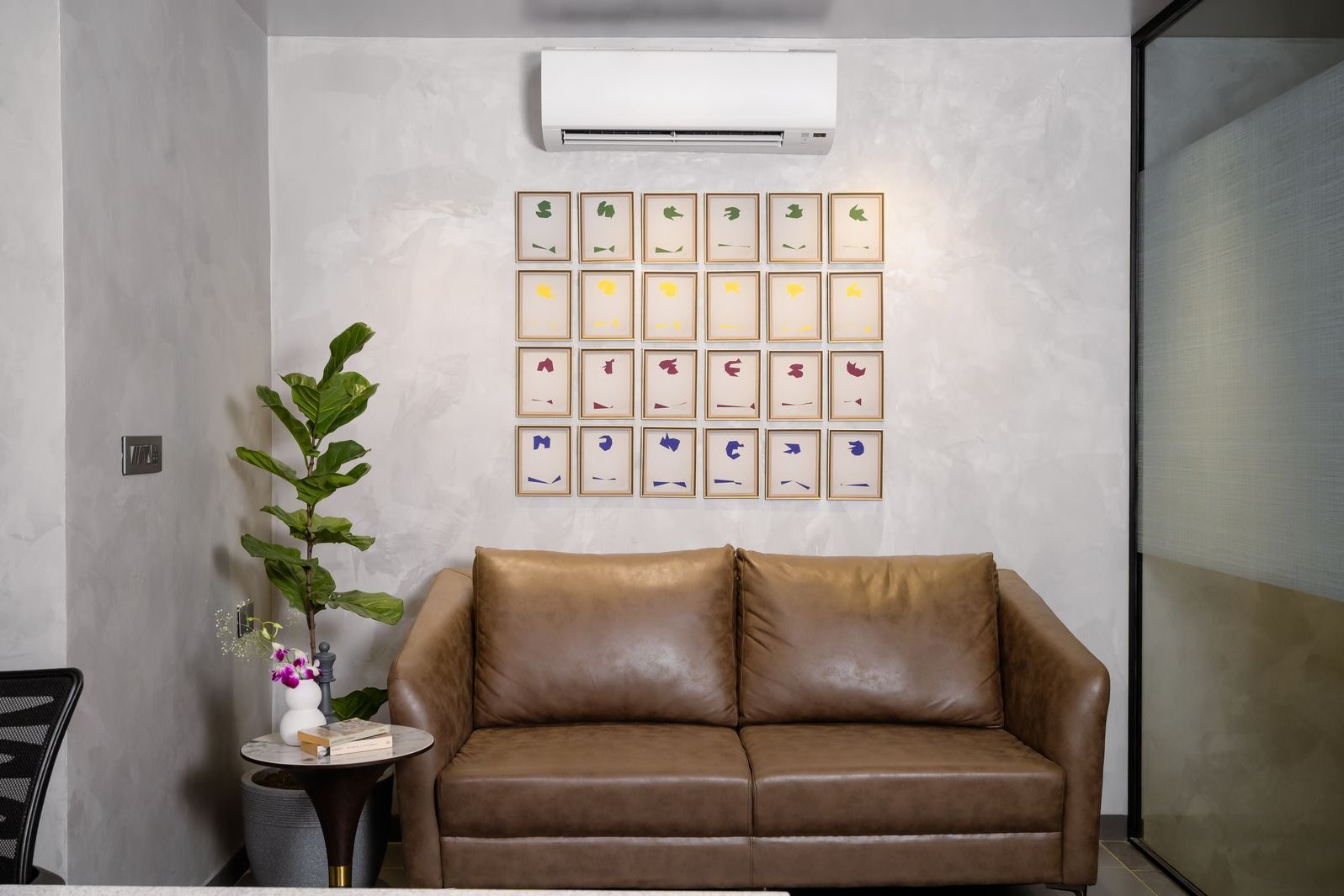
The grid is the most forgiving layout here, because every decision is made by measurement instead of by eye.
Frames of one size, in two or three even rows, spaced an identical 2 to 3 inches apart in every direction, and the wall looks calm and architectural even above a busy patterned sofa. It suits matching sets: a print series, black and white photographs, botanical plates. Choose frames with a decent mat, because the white border does half the styling work before the art gets a say.
Because the grid is so orderly, it sits well alongside the looser living room wall art ideas in this cluster, where one tidy wall rests the eye. The failure mode is drifting rows. Mark both row lines in tape before the first nail, not after the third frame.
2. The Symmetrical Pair or Triptych, the Quietest Wall Here
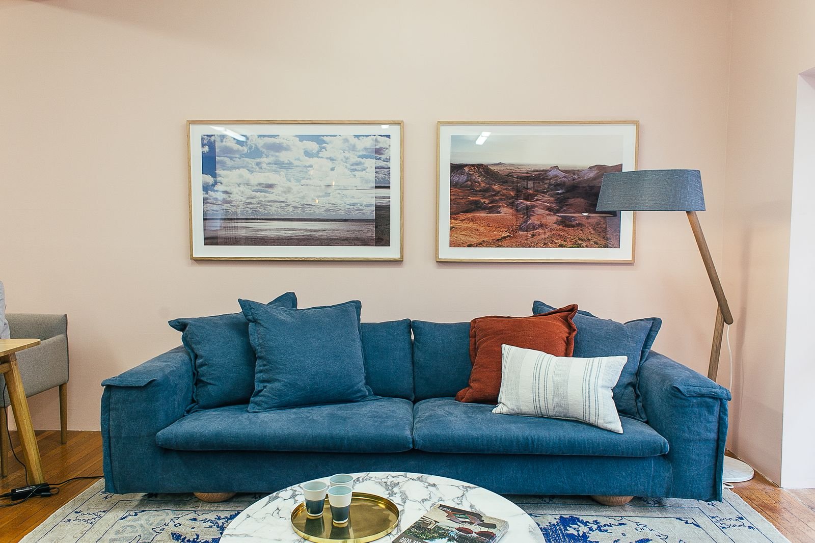
Two large matching frames, or three in a row, centered exactly over the sofa. That is the whole design, and it is enough when the art itself is strong: oversized abstracts, a split landscape, architectural drawings.
Keep the combined width inside the 60 to 75 percent guide and hang the pieces so their centers sit at standing eye level, which usually lands the bottom edge a hand span above the sofa back. Symmetry forgives small rooms and rental walls because it needs only two or three fixings.
Heavy pieces? This is also your safest layout: few holes, properly anchored, carrying real weight. Skip the adhesive strips for anything with glass and a real frame. Gravity is patient, and it always collects.
3. Salon Style, Packed Tight on Purpose
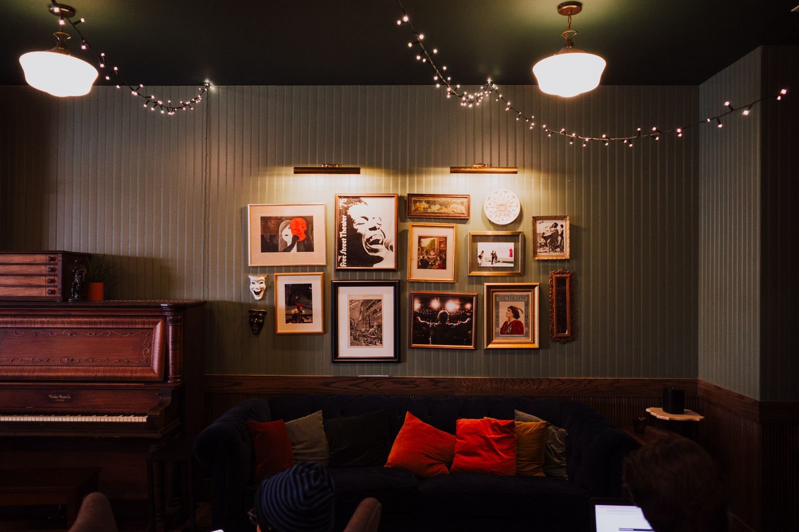
Salon style is the grid’s opposite: frames of every size hung close, from near the sofa back to near the ceiling, mixing art, mirrors, plates and small objects. Done well, it looks like a lifetime of collecting. Done badly, it looks like a jumble sale.
The discipline is in the edges. Keep the outer boundary of the whole group roughly rectangular, hold spacing to the same 2 to 3 inches everywhere, and repeat one frame finish at least three times so the eye finds a thread. Start from the center and build outward, exactly as with the bolder living room wall ideas that pop, and fill the gaps with your smallest pieces last.
My rule: if a piece only fits by squeezing the gaps around it, it does not belong on this wall. Salon density is planned, never forced.
4. Center Out: One Hero, Then the Supporting Cast
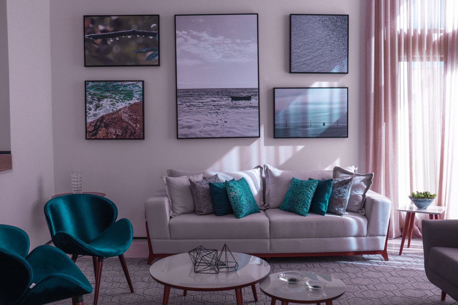
Pick the largest or boldest piece you own. Hang it dead center above the sofa. Then arrange smaller frames around it like a supporting cast.
This layout flatters art lovers because the hero gets its spotlight, and it is the easiest loose layout to plan on the floor, since the composition builds itself outward. Keep the satellites lower in contrast than the hero, or the wall argues with itself. Balance weight rather than shapes: one dark small frame on the left can offset a large pale one on the right.
Photograph the floor plan from above before a single hole. Center out walls fail on balance, never on spacing, and balance is invisible until the wall is up and annoying you daily.
5. The Long Low Line, for Low Sofas and Low Ceilings
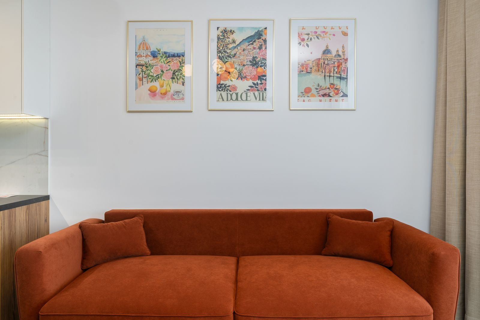
One single row of frames stretched along most of the sofa’s length. It is the modern minimalist’s gallery wall, and it widens a wall instead of stacking it, which suits low backed sofas, low ceilings and long rooms.
Use three to five frames of the same height, aligned on their bottom edges like a horizon, subjects connected: a panoramic series, a sequence of photographs, line drawings. Sit the row closer to the sofa than to the ceiling, center around standing eye level. Vary the art inside the frames rather than the frames themselves, one photograph, one drawing, one print, one textile piece, and let the shared height hold the row together.
Alignment is everything here, and the eye lies. Use a level and a taped baseline. A row that drifts two degrees looks like a shelf after an earthquake.
6. The Stair Step Rise
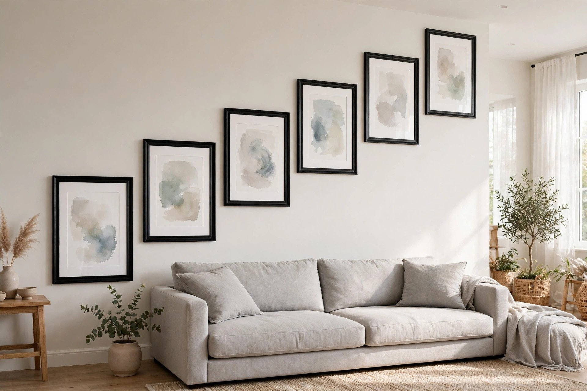
Here the frames step upward like a staircase, low over one arm of the sofa and climbing toward the opposite corner. It is the right answer for walls that run into a stairwell, rooms with a sloped or very high ceiling on one side, and collections spanning awkward sizes.
Keep the steps even: each frame’s top edge the same amount higher than the last, roughly two to four inches per step, and the same 2 to 3 inch spacing throughout. Anchor the low end with your heaviest piece, because a rising wall pulls the eye upward and the base needs to feel planted.
Let the top end stop well short of the ceiling line. A climb that nearly reaches the ceiling looks unfinished, like the wall ran out of money at the top step.
7. Ledges and Leaning, the Wall That Changes Its Mind
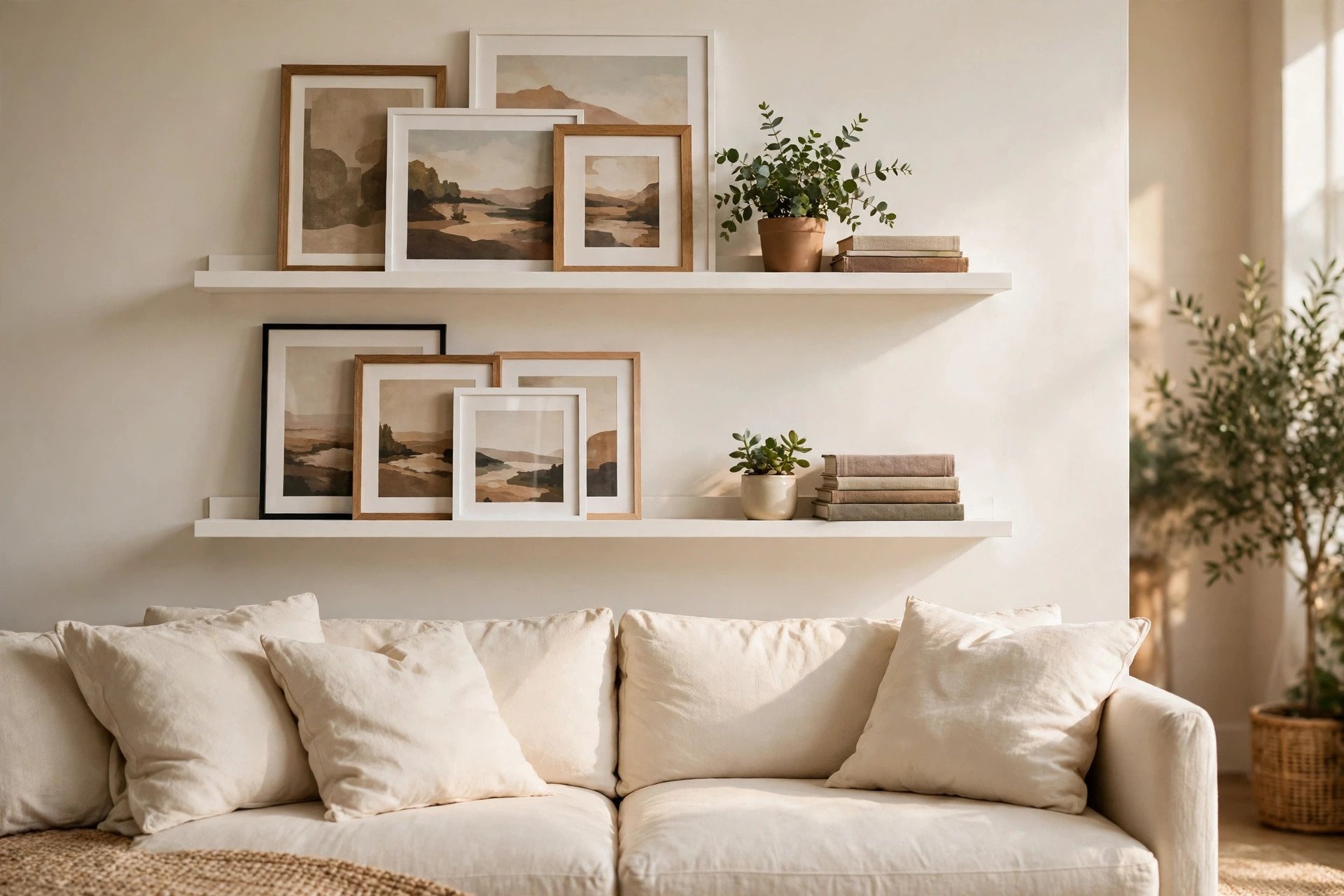
Two picture ledges, mounted one above the other, turn the gallery wall into a rotating exhibition. Frames lean in overlapping layers, mixed with a small plant, a stack of art books or a ceramic piece, and the whole display changes in minutes with no new holes. This is the renter’s favorite and the indecisive decorator’s best friend.
Style it with the same borrowing used in bookshelf styling ideas: group in odd numbers, vary the heights, leave gaps so the ledge reads curated rather than crowded. Choose ledges with a front lip deep enough for your thickest frame, and check the load rating before you fill both shelves.
The one honest cost: dust. Leaning frames collect it along every overlapped edge, so this wall wants a monthly wipe the grids never ask for.
8. The Organic Cluster, Judged by Its Silhouette
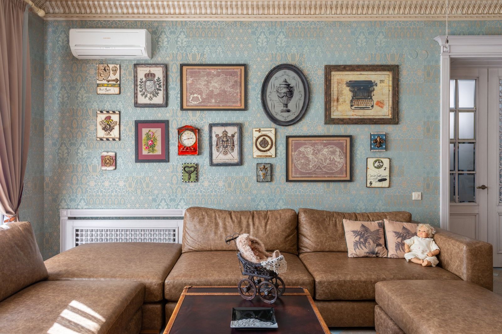
This layout drops the invisible rectangle and lets the group take a soft, rounded shape, wider in the middle, tapering at the corners. It is the warmest layout for family rooms because it absorbs anything: photographs, a round mirror, a woven plate, the children’s art in grown up frames.
Build it around a center line at eye level and grow outward in all directions, gaps even, with one round piece mixed in for every few rectangles. Without straight outer edges to guide you, the floor plan and paper templates matter more here than in any other layout in this guide.
I step back every third frame on an organic wall, from the doorway, not from under it. These walls are judged by silhouette, and the silhouette only exists from across the room.
9. The Two Row Sweep, Presence Without the Chaos
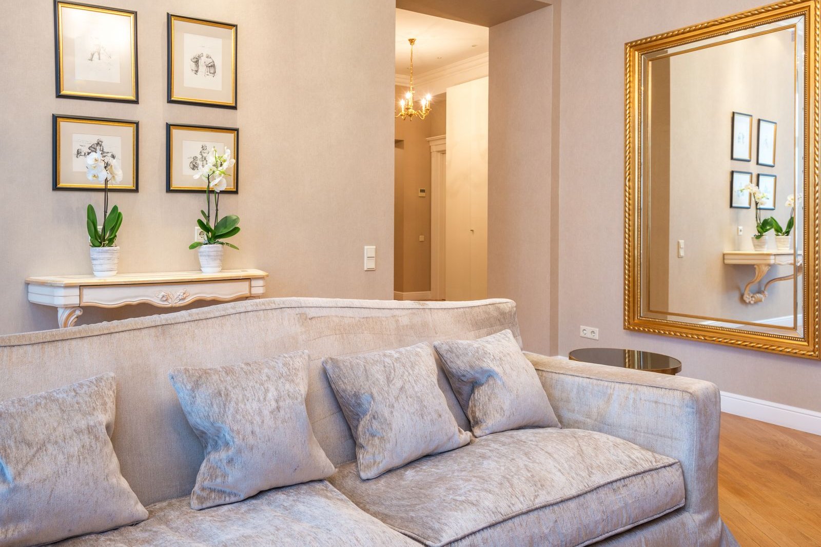
Two generous rows, stacked with a little more air between the rows than between the frames, give you gallery presence without salon noise. It suits wide sofas and wide walls, and it is the best layout here for mixing media by row: photographs above, prints below, or landscapes on one level and portraits on the other.
Keep both rows the same overall length so the whole thing reads as one rectangle, and line up the outer edges of the top and bottom rows even if the frames inside them vary. Hang the bottom row first and set the second from its line. Put the largest, heaviest frames in the bottom row, where they anchor the wall and sit close to their fixings, and let the top row run lighter.
From across the room, the sweep should read as one calm rectangle of art. Visitors call this the magazine wall. Two disciplined rows are all that is.
The Bottom Line
A gallery wall above the couch succeeds on proportions before it succeeds on art. Span most of the sofa without passing it, keep one gap measurement and repeat it everywhere, plan on the floor and prove it in paper, and the hanging becomes the easy part. Choose by nerve: the grid or the pair for calm, center out or the organic cluster for character, the ledges if you know you will change your mind. Your wall and your sofa will look like they were always meant to be together.
Start with the tape. Mark 60 to 75 percent of your sofa’s width on the wall tonight, and every decision after that one gets smaller.
Frequently Asked Questions
How high should pictures hang above a couch?
The bottom of the grouping should sit roughly a hand span above the sofa back, commonly given as about 6 to 8 inches, so the art connects to the furniture instead of floating toward the ceiling. The center of the whole arrangement lands near eye level for a standing viewer. If the wall is mostly seen from seats, err slightly lower rather than higher.
How much space should be between gallery wall frames?
About 2 to 3 inches, kept consistent across the whole wall. Tighter gaps suit dense salon style walls, looser gaps suit airy modern rooms. Inconsistent spacing is what makes a wall look accidental, so pick one measurement and repeat it everywhere.
Should a gallery wall be wider than the couch?
No. A grouping wider than the sofa looks top heavy and makes the furniture under it feel undersized. Aim for about 60 to 75 percent of the sofa’s width, and center the art on the sofa rather than on the wall when the two do not line up, always on the sofa.
How do I plan a gallery wall without making test holes?
Lay the full arrangement on the floor inside taped dimensions and photograph it, then trace every frame onto paper and tape the templates to the wall. Live with them for a day, adjust until the silhouette pleases you, then hang through the paper, center piece first, tearing the templates away as each frame goes up.