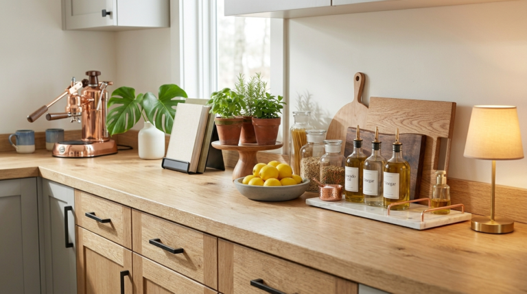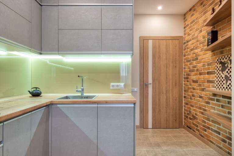
12 Two-Tone Kitchen Cabinet Ideas You Can Paint Yourself
The darker color goes low. The lighter color goes high. That is the whole rule, and nearly every two tone kitchen that works is built on it.
Dark base cabinets ground the room and hide the scuffs that collect at kick boards. Light uppers bounce daylight at eye level, so the room stays bright. I paint the test door first, always, because cabinet colors change more than wall colors do. The 12 pairs below all follow that rule, and every one of them is a realistic weekend project with a brush, a small roller and some patience.
The short version, before we start:
Dark low, light high. It anchors the room instead of making it top heavy, and it hides wear where wear happens.
Sample first. Paint one door or a big board in each color and live with it for several days, in morning light, evening light and gray light.
Prep is the job. Wash, degrease, scuff sand, prime, then two thin coats with a light sand between. Rushing prep is how paint peels.
Small kitchen? Shrink the idea. One dark run of lowers, or just the island, gives you the contrast without chopping up the room.
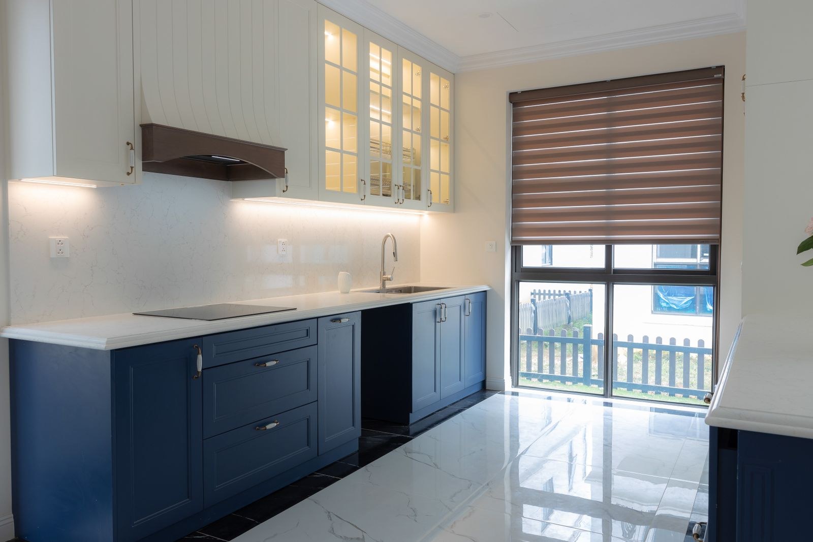
1. Navy Lowers, White Uppers: Start Here
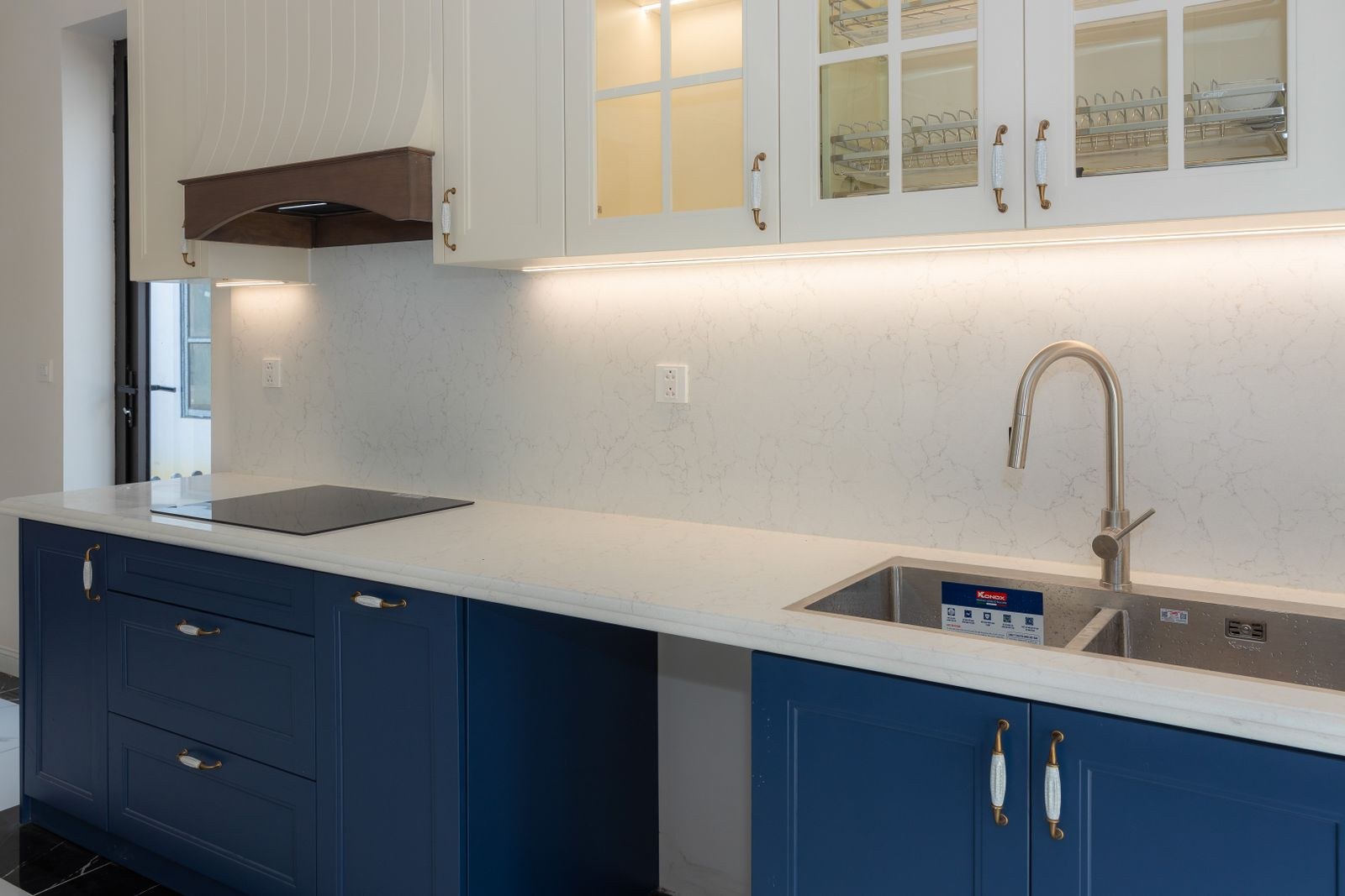
Navy below and white above is the pair that started the modern two tone trend, and it still works in almost every kitchen.
The navy grounds the room and forgives the daily kicks and drips at base cabinet level. White uppers keep the eye level bright. Brass or warm wood handles warm the pair up; chrome keeps it crisp. Choose the backsplash after the cabinets, because navy makes pale tiles glow and dark tiles go moody. If commitment scares you, the removable peel and stick backsplash ideas let you test the pairing first.
This is the pair I point nervous friends at. It asks nothing risky of the room and it will not raise a single eyebrow from future buyers.
2. Sage Lowers, Cream Uppers: The Soft Way In
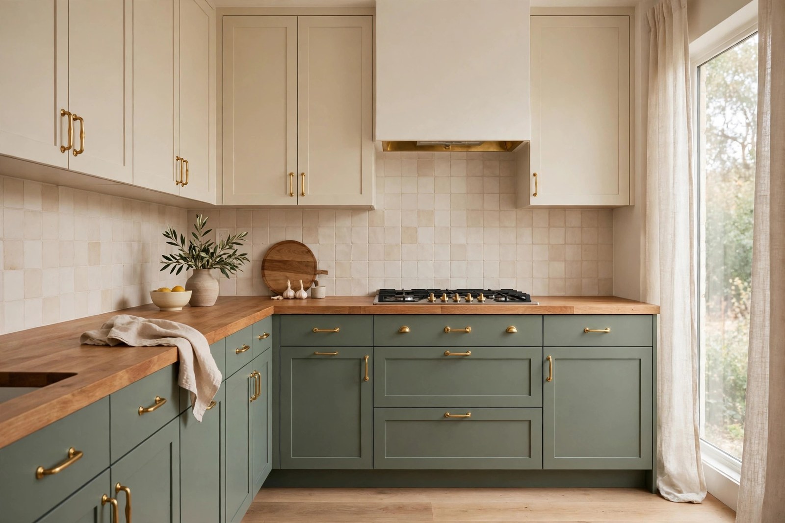
Sage is the gentle way into color. It is a grayed, leafy green that reads almost neutral in low light and clearly green in sunshine.
Pair it with warm cream uppers rather than stark white, and the kitchen takes on the calm of a garden room. Two colors, one job each: the green works at scuff level, the cream lifts the eye level. It flatters wood counters, stone and warm metals, and it hides everyday marks far better than white lowers ever will, which matters down at the kick boards. Keep the walls in the same cream family so the uppers blend upward and the green does the talking.
Sage suits north facing kitchens especially well. Both colors carry warmth that cool daylight cannot wash out.
3. Forest Green Lowers: One Step Deeper
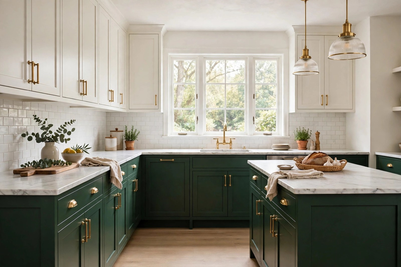
One step deeper than sage, forest green brings a tailored, library like richness that makes plain slab doors look expensive.
Warm white uppers stop the room going cave like, and the contrast is strong enough that you need very little other decor. This pair loves marble look counters, unlacquered brass and warm lighting. It can fight with cool gray floors, so hold a painted board against your floor before committing to anything.
Here is the trick most people miss: paint only the lowers first and live with it for a week. Many kitchens find the deep green alone changes the room so completely that the uppers only need a freshening coat of the white they already wear.
4. Charcoal and Pale Gray: Two Tone Without Color
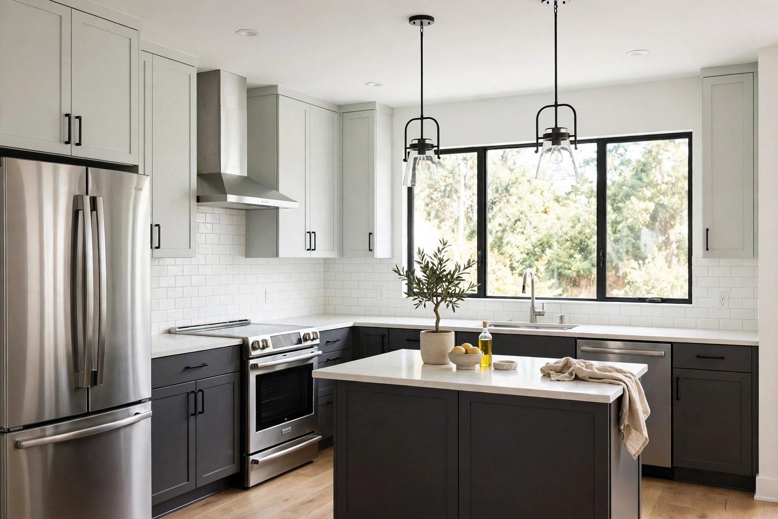
Charcoal and pale gray is the scheme for people who do not want color. They want tone.
Charcoal bases give you the depth of black with softer edges and a kinder relationship with fingerprints. Pale gray uppers keep the whole scheme inside one family, so it reads designed rather than decorated. It suits stainless appliances perfectly, since the kitchen stays in the silver to charcoal range from top to bottom.
The catch: this pair can go cold and flat, like a photo in grayscale. Add warmth on purpose, wood boards, a woven runner, warm bulbs. Matte or satin finishes on both colors keep it modern and hide brush marks best.
5. Wood Lowers? Then Only Paint the Uppers
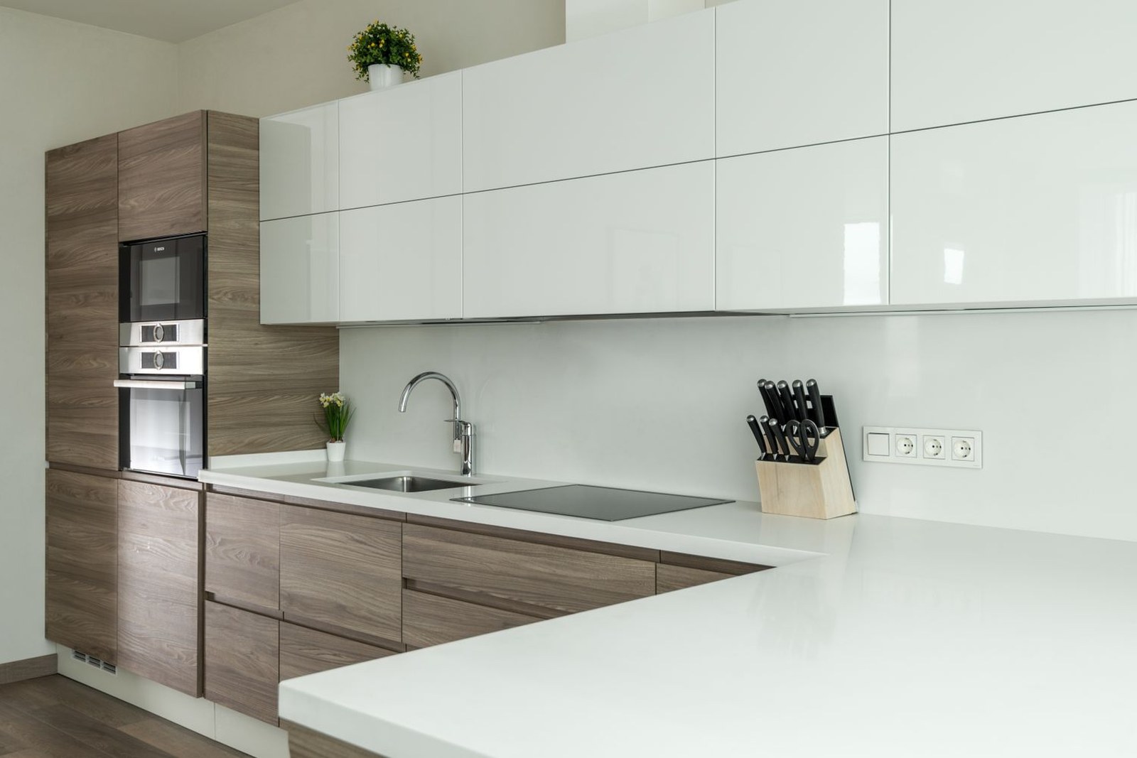
Not every lower cabinet needs paint. If your base cabinets are real wood in decent shape, leave them.
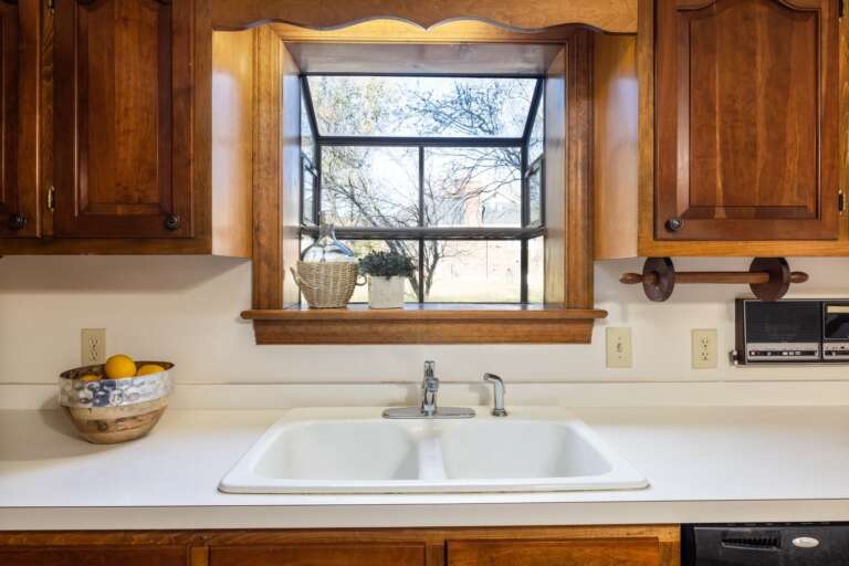
Painted white uppers over warm wood lowers is the most timeless two tone of all: half modern, half farmhouse, and the wood brings the warmth that painted schemes have to borrow from accessories. A crisp white up top makes tired wood look deliberate instead of dated. Finish with the styling restraint of good kitchen counter decor picks: a few wood boards echoing the lowers, and nothing else competing.
It is also the cheapest route on this list. Half the cabinets, half the paint, half the weekend.
6. Black Lowers, Bright White Uppers: The Bold One
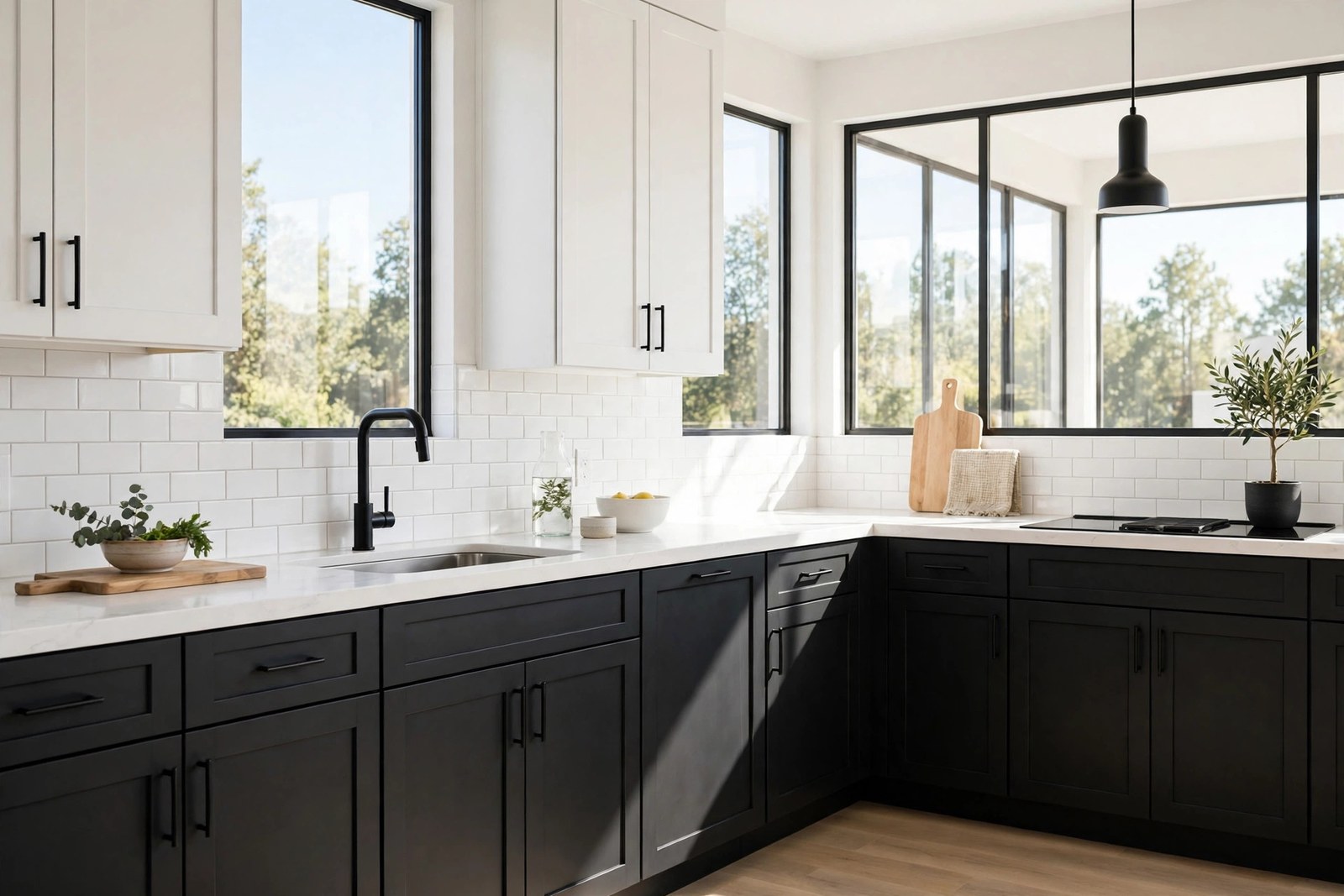
Black and white is the boldest classic: graphic, high contrast, and completely unforgiving of a messy kitchen. That is either its charm or its warning.
Black lowers hide everything, anchor the room like furniture, and make white uppers and pale counters look almost luminous. Keep hardware minimal, or black on the lowers, so they read as one dark mass. Add one warm element, wood stools or a jute runner, so the contrast has somewhere to soften.
But test honestly. In a dim kitchen, black bases swallow the light the floor area needs and the room feels smaller by evening. Paint a big board, lean it against the lowers, and live with it through a few gray days before the black goes on for real.
7. Terracotta Lowers for the Sunny Kitchen
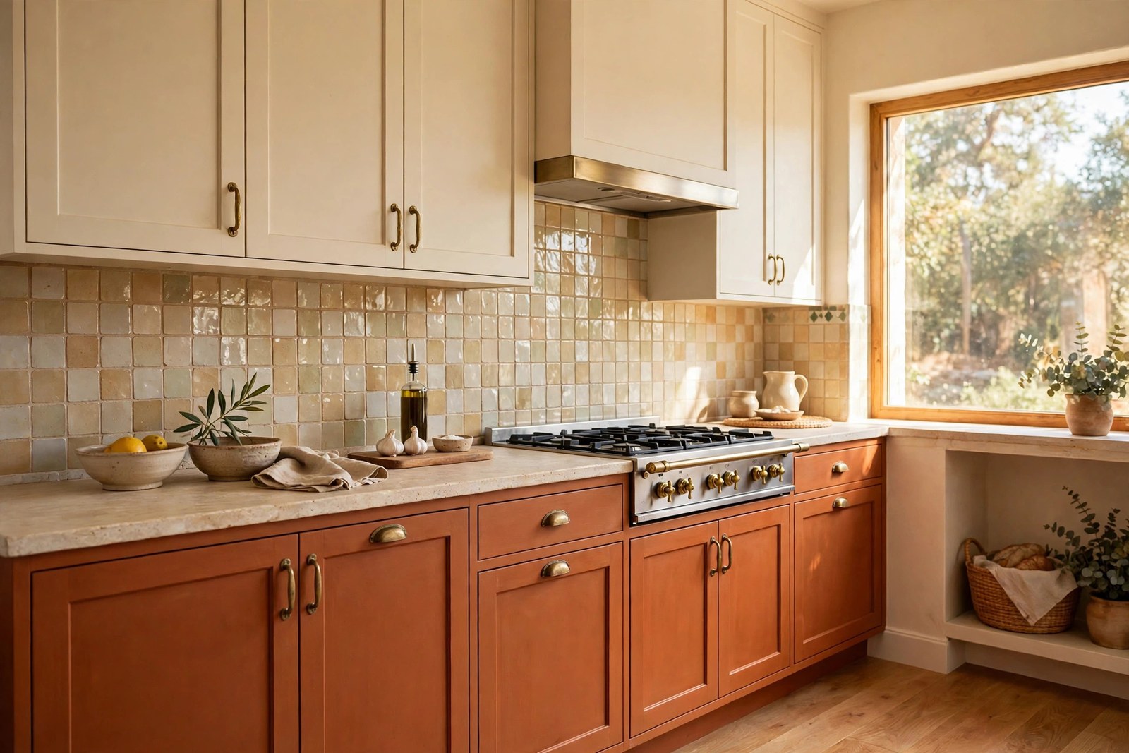
Terracotta brings the sun baked warmth that the cooler pairs on this list cannot.
As a lower cabinet color it is surprisingly livable: earthy enough to hide marks, warm enough to flatter wood and stone, and it deepens beautifully under evening light. Warm cream uppers keep the palette soft and stop the orange undertones from shouting. This pair loves handmade look tiles, woven textures and plants, and it suits kitchens that open onto dining spaces, because the palette feels social rather than clinical.
Still unsure? Paint one run or the island first. Terracotta rewards a trial area, because its mood shifts so kindly with the light through the day. It is the color I would choose for a kitchen that opens onto a garden.
8. Dusty Blue Lowers: The Forgiving Blue
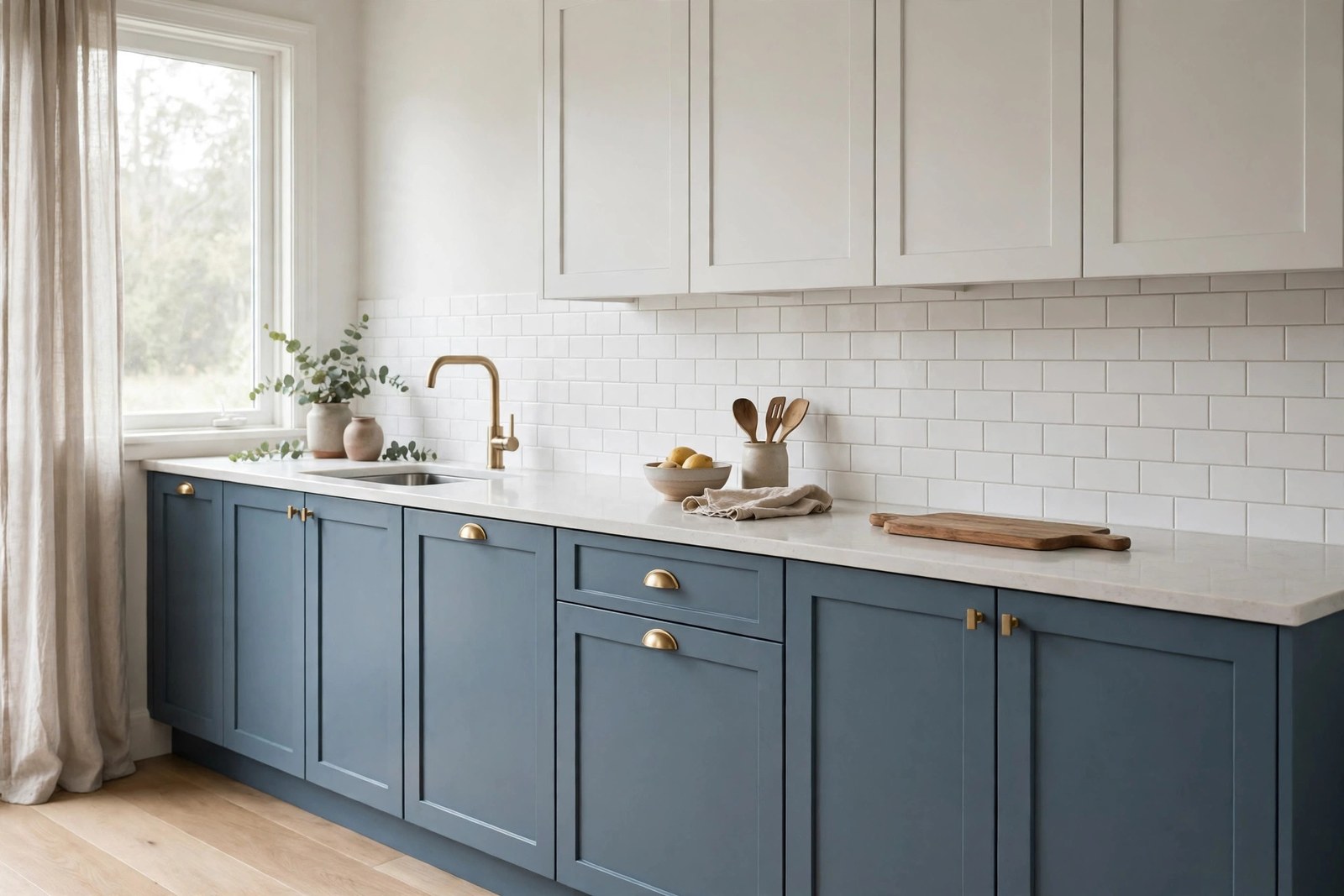
Between navy and gray sits dusty blue, a muted, chalky blue that feels coastal without a single nautical prop in sight.
It is softer than navy in small rooms and kinder to warm floors than most gray blues. Soft white uppers, not bright optical white, keep the whole scheme hazy and calm. Silver or brushed nickel hardware blends in; black handles add a gentle outline. Pick one hardware finish and repeat it, because blue this calm does not need two metals arguing. Pair it with pale counters to keep the lightness the scheme promises.
Its real virtue shows on gray Tuesday mornings, when the kitchen feels like sea air instead of a workspace. I find it the easiest blue to live with day after day.
9. Greige and White: Two Tone You Feel, Not See
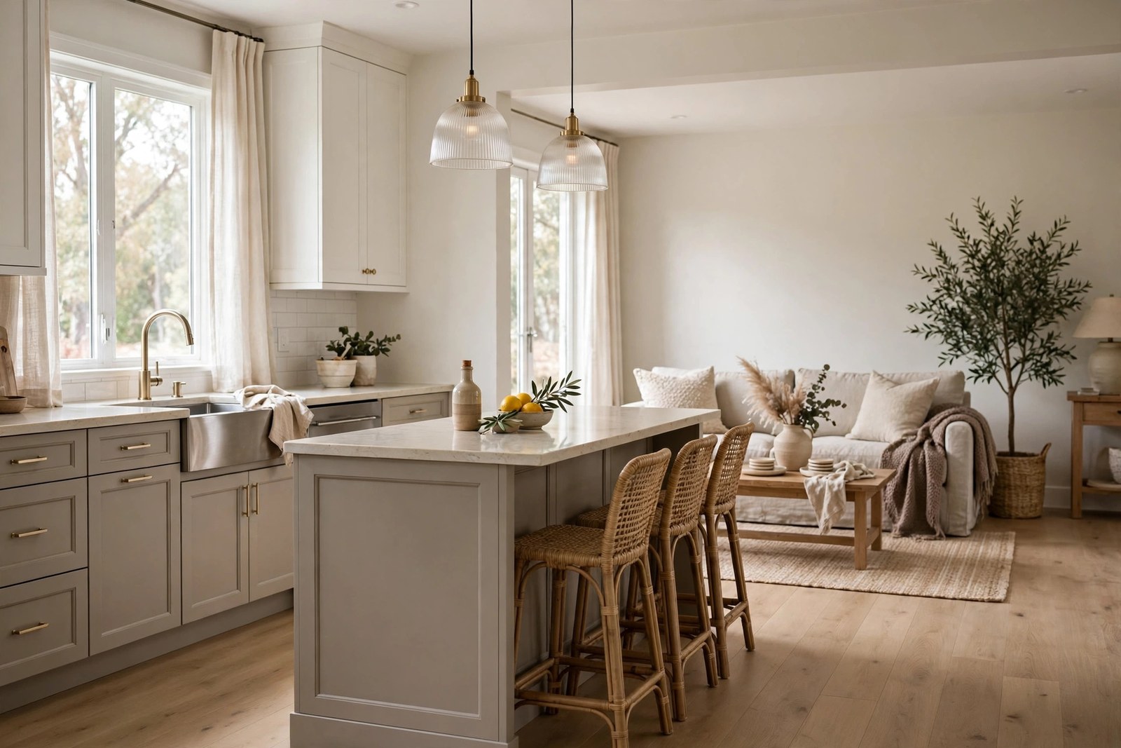
If you like the idea of two tone but not the drama, go tonal.
Warm greige lowers, white uppers, and a difference you feel more than see. I find greige boring in photos and exactly right in real life. The slightly deeper base grounds the room, hides wear, and lets counters, hardware and textiles carry the personality. This is the easiest pair to live with long term and the easiest to sell a house with, because it asks nothing of the next owner. It is also the best pair for open plan spaces, where a strong cabinet color can shout across a whole living area.
Pick a greige with a warm undertone for north light and a cooler one for south light, and carry both colors into the next room’s trim so the scheme runs on without a seam.
10. Let the Island Carry the Contrast
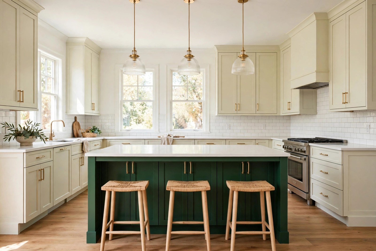
When the perimeter cabinets all match and you want two tone without repainting everything, paint the island.
A deep navy, green or charcoal island against pale perimeter cabinets puts the dark anchor in the middle of the room, where it reads as furniture. The effect is reversible in a weekend if you tire of it, which no full repaint can claim. Keep the island color in the same family as something else nearby, a blind fabric, a runner, the stools, so the contrast looks chosen rather than stranded.
The island is also the natural test bed for a dream color. If a deep green earns its place there for six months, it has earned the lowers too.
11. Small Kitchen? Paint One Dark Run Only
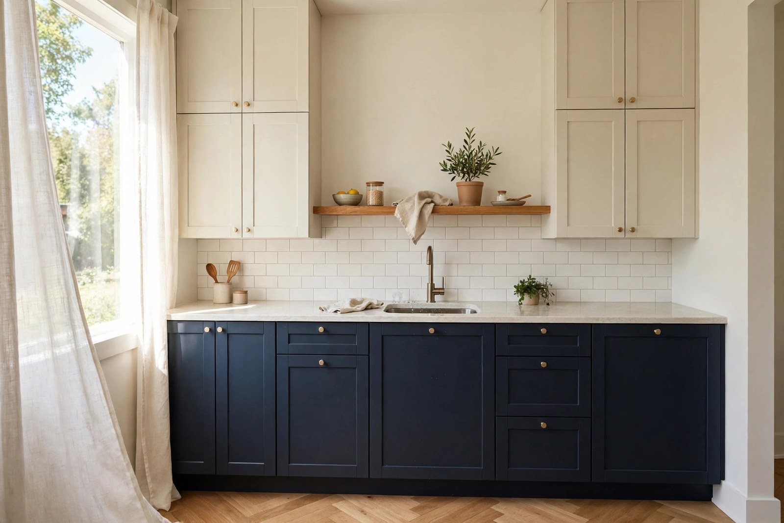
Full two tone can chop a small kitchen into visual pieces. Scale the idea down instead: paint only the lowers of one run, usually the run under the window or along the main counter, and keep every other cabinet the lighter shade.
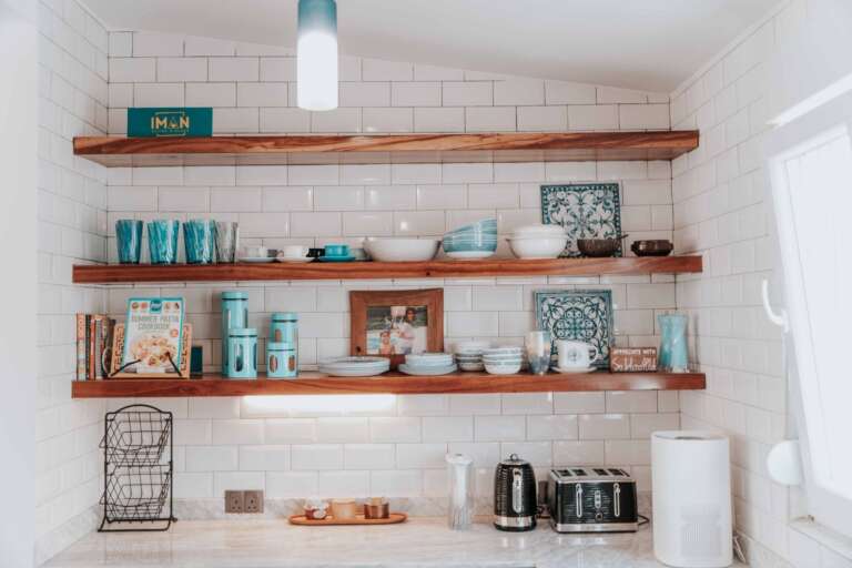
The room keeps its brightness and gains one grounded working wall. Swap a pair of upper doors on that same run for open shelves and the dark section feels even more deliberate; the styling discipline from open kitchen shelf styling ideas keeps those shelves from undoing the calm. This matches how small kitchens actually get organized, in single zones, as the small kitchen organization ideas in our kitchen cluster keep showing: one strong zone beats a whole room of half decisions.
12. Sample First: The Test Door and the Light Check
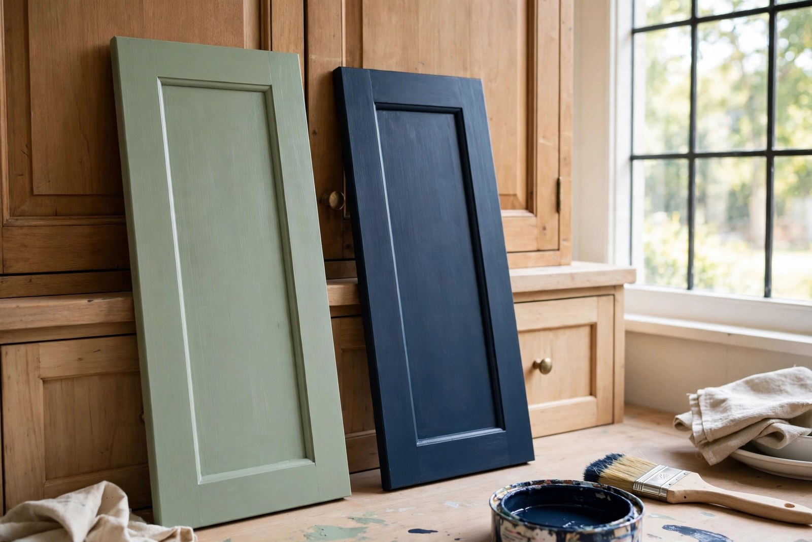
Whichever pair you choose, the cheapest professional step comes first: paint one door, or a large board, in each color and live with it in place for several days.
Cabinet colors change more than wall colors do, because they sit at every height and catch light at every hour. Check the pair in morning light, under your evening bulbs and on a gray day before ordering full tins. A gallon of cabinet paint usually runs about $50 to $80, and two doors are not worth wasting it on guesswork.
The test door is also where you prove your prep. Wash and degrease it, scuff sand until the shine is gone, prime with a primer made for cabinet surfaces, then two thin coats with a light sand between. Skip the degrease and the paint will peel in sheets near the stove within months; kitchens are greasy places and paint knows it. And give the final coat real curing time, several days before the doors hang and a week or more before hard use, or fresh doors stick to the frame and pull their own paint off. Skip buying a sprayer for one kitchen, by the way. A small foam roller and a good angled brush do this job fine.
The Bottom Line
Two tone works because of one rule and one habit: darker below, lighter above, and a sample door before any full tin gets opened. Pick the pair that respects your light and your floor, shrink the idea to one run or the island if the kitchen is small, and let prep take the time it takes. Done that way, a painted kitchen looks like a fitter installed it.
Start with the test door this weekend. Two colors, one door, three kinds of light, then decide.
Frequently Asked Questions
Should upper or lower cabinets be darker in a two-tone kitchen?
The lower cabinets should carry the darker color in almost every case. Dark bases ground the room, hide scuffs and spills where they actually happen, and let light uppers bounce daylight at eye level. The reverse can work in a tall, very bright kitchen with a deliberate reason, but as a default it makes rooms feel top heavy and smaller.
What colors pair well for two-tone cabinets?
The proven pairs are navy with white, sage with cream, forest green with warm white, charcoal with pale gray, dusty blue with soft white, and natural wood lowers with painted white uppers. Terracotta with cream suits warm, sunny rooms, and greige with white is the low contrast option. Match the pair’s warmth to your floor and your light before anything else.
Can you paint two-tone cabinets yourself?
Yes, this is one of the most DIY friendly kitchen upgrades there is. Work door by door: take off and label the hardware, wash and degrease, scuff sand, prime with a primer made for cabinet surfaces, then two thin coats of cabinet paint, letting each coat dry fully. A small foam roller and a good angled brush give a smooth finish, and the final coat needs several days of curing before the doors hang and get used hard.
Do two-tone cabinets work in a small kitchen?
They do, with the scale adjusted. Keep the contrast gentle, paint one dark run of lowers instead of the whole room, or let the island carry the second color. Light uppers matter even more in a small kitchen, since they keep the eye level bright. A tonal pair like greige and white gives the two tone structure with almost no visual risk.