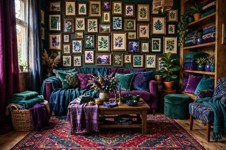
Bold Color Trends for Your Home
Neutrals had a long, polite run, but homes are getting braver. The bold color trends shaping this year are not loud for the sake of it. They are rich, grounded shades, emerald green, deep burgundy, charcoal slate and warm terracotta, used with intention so a room feels confident rather than chaotic.
The secret is zoning. Instead of washing every wall in one strong color, these homes assign each shade a job and a place, then tie the zones together with texture and light. This guide walks through one complete bold scheme step by step, so you can borrow the whole plan or steal single ideas for a weekend refresh.
1. Defining the Zoned Living Space

Zoning is what makes bold color livable in an open plan room. Rather than one shade everywhere, each activity area gets its own color identity, a deep green reading corner, a burgundy sofa zone, charcoal around the media wall. Rugs mark the borders, and furniture placement does the rest. Start by naming the zones your room actually holds, usually seating, reading and dining or work. Assign the boldest color to the zone you use most, because that is where you will enjoy it. Keep ceilings and trim in one soft neutral throughout so the zones read as chapters of the same book, not separate rooms fighting.
2. Introducing Rich Burgundy for Depth and Cohesion

Burgundy is the warmth engine of a bold scheme. It sits between red and brown, so it feels dramatic without shouting, and it flatters wood, brass and warm lighting. Use it on the largest soft surface you own, usually the sofa, or on one wall behind it if the sofa is neutral. Then repeat burgundy at least twice more in smaller doses, a cushion across the room, a throw, a lampshade or a rug border. Repetition is what turns a brave color into cohesion. If a full wall feels risky, test the shade on the inside of a bookcase or a single door first.
3. Mastering Contrast: Charcoal Slate for Visual Anchoring

Every bold scheme needs one quiet, dark anchor, and charcoal slate does that job better than pure black. It is softer, slightly blue grey, and it makes brighter colors beside it look intentional. Use charcoal on the media wall, a fireplace surround, built in shelving or large furniture pieces like a cabinet. The anchor gives the eye a place to rest between the richer shades. Balance is the rule. Roughly a third dark anchor, a third bold color and a third light neutral keeps a room dramatic but breathable. If the space feels heavy, add light through textiles before you remove any color.
4. Transitioning the Trend: Sage Green with Terracotta Roots

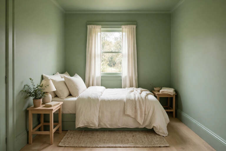
Sage green is the bridge color of this palette. It cools the heat of burgundy and terracotta, connects indoor rooms to the garden outside, and works in hallways and kitchens where the deepest shades might feel too much. Pair sage with raw terracotta in pots, tiles or cushions and the two bring out the best in each other, one calm, one earthy. This pairing is a gentle way to transition between a bold living room and quieter bedrooms. Paint the hallway sage, carry terracotta accessories through it, and the whole home feels planned rather than patchwork.
5. Integrating the Zoned Kitchen Concept

A bold living room falls flat if the kitchen next door looks forgotten. Carry the scheme through with one strong move rather than a full remodel. Paint lower cabinets or an island in your anchor charcoal or a deep green, keep uppers light, and repeat your warm metal in handles and a faucet if you are replacing them anyway. Terracotta can live in tiles, a runner or crockery on open shelves. Color zoning in a kitchen also has a practical side. Darker lowers hide scuffs in the work zone, while the light upper half keeps the room feeling open while you cook.
6. Embracing the Moody: Deep Shadows in Pakistani Home Design

Strong sunlight changes how bold color behaves, and homes in Pakistan live with some of the brightest light anywhere. Deep shades earn their keep there, because what looks moody in a photograph looks calm and cool in a sun filled room at noon. North and west facing rooms with harsh afternoon sun suit burgundy and emerald especially well, since the light cannot wash them out. Layer curtains or sheer blinds so you can soften the contrast when you want it. Pair the deep walls with local texture, carved wood, woven throws and clay pieces, and the mood feels rooted rather than imported.
7. Defining the Cocoon: Creating a Zoned Reading Nook

The reading nook is where bold color gets personal. Wrap one corner in the deepest shade of your scheme, on the walls behind a chair or even in a painted alcove effect, and the space instantly feels like a cocoon. Add the comfort kit, a chair with a high back, a footstool, a small side table and a warm lamp at shoulder height. Keep this zone one color family only, because calm is the point. It is also the cheapest bold move in this whole guide. One small wall and a chair corner take a fraction of the paint a full room needs, so it is the perfect first experiment.
8. Anchoring the Texture: Terracotta Grouping in Modernity

Sleek bold rooms can start to feel like showrooms, and terracotta is the antidote. Group clay pots, vases and bowls in odd numbers, three or five, mixing heights and finishes, matte beside glazed, smooth beside rough. Place the group where two color zones meet, on a console between the living and dining areas, for example, and it physically stitches the scheme together. Handmade pieces carry tiny imperfections that flat painted surfaces lack, and that contrast is what designers mean by depth. Start with pieces you already own. A plant pot, a serving bowl and a jug from the kitchen make a perfectly good first grouping.
9. Synthesizing the Complete Pakistani Zoned Blueprint

Now step back and read the whole home as one blueprint. The living room carries the boldest zones, the kitchen echoes them in cabinets and clay, the hallway bridges with sage, and the reading nook concentrates the deepest shade. What makes it work for family homes in Pakistan is practicality as much as looks. Dark zones hide the wear of busy shared rooms, washable textiles handle dust, and strong color means a room still looks dressed on days when it is simply lived in. Walk the route from front door to kitchen and adjust any color that appears only once. Every shade should show up at least twice.
10. Utility Texture Study: The Contrasting Towel Stack

Bold color does not stop at the bathroom door, and the smallest study in contrast is a stack of towels. Fold towels in two alternating shades from your palette, say charcoal and terracotta, and stack them on an open shelf or stool. The stack works three ways at once, storage, texture and a color echo of the main rooms. It costs nothing if you already own the towels, and it is fully reversible, which makes it a kind test for anyone still nervous about the trend. Apply the same trick in the kitchen with tea towels and in bedrooms with folded throws at the foot of the bed.
Conclusion
Bold color works when it is treated as a plan, not a dare. Zone the room, let burgundy bring the warmth, charcoal bring the anchor and sage bring the calm, then stitch everything together with terracotta texture and repeated touches in every room, right down to the towel stack. Start with the reading nook or a single wall, live with it, and expand the shades that make you happy. A home with confident color feels personal in a way no safe neutral ever quite manages.
This pairs well with our guide to color drenching in small rooms.
Frequently Asked Questions
What is the easiest bold color to start with?
Deep green is the most forgiving first step. It behaves almost like a neutral, pairs with wood, brass and cream, and suits both bright and low light rooms. Try it on one wall, an island or a bookcase backing before committing to a full room.
How do I stop bold colors from clashing?
Give every shade a zone and a job, then repeat each one at least twice around the home. Keep ceilings, trim and one metal finish the same throughout, because those shared elements are what make different colors feel like one scheme.
Do dark colors make a room look smaller?
They make walls feel closer, which reads as cozy rather than cramped when the room has enough light and one light neutral to balance it. In small rooms, use the deepest shade on one wall or in a nook instead of on all four walls.
Can I use bold color trends in a rental?
Yes, through everything that is not paint. Sofas covers, cushions, rugs, curtains, towels and terracotta pieces carry the whole palette, and peel and stick wallpaper can give you one bold wall that comes down cleanly at moving time.